Static Plots
Contents
Static Plots
対象者
pandas DataFrame / Series は使ったことがある方
plot を使って、静的な描画を簡単に行いたい方
そこそこのデータ量を扱いたい方
目次
.plot()メソッドのオプションを使うmatplotlib を組み合わせて描画する
価格帯別出来高とMarket Depth を 描画する
データ
cryptochasis の約定データを使ってOHLCVデータを作成
スクリプトは botter4visualization/data.py に記載しています
# warning 非表示
import warnings
warnings.filterwarnings('ignore')

import pandas as pd
pd.__version__
'1.4.2'
データ作成方法
botter4visualization/data.py をお使いください
cryptochasisが対応している取引所などはこちらで確認してください
install するライブラリなどは、requirements.txtで確認してください
今回使ったデータと同じデータを作成するには
$ python data.py download-execution-files
$ python data.py gz-to-pickle
オプションを確認するには
$ python data.py --help
データ読み込み
約定データを読み込み、5分足のOHLCVに変換します
df_btc_eur =pd.read_pickle("../data/binance_btc-eur.pkl")
df_btc_eur.head()
| time_seconds | price | size | is_buyer_maker | instrument | |
|---|---|---|---|---|---|
| datetime | |||||
| 2022-03-19 00:00:00.872000+00:00 | 1.647648e+09 | 37859.61 | 0.00050 | 0 | btc-eur |
| 2022-03-19 00:00:27.573999872+00:00 | 1.647648e+09 | 37878.52 | 0.00060 | 1 | btc-eur |
| 2022-03-19 00:00:27.941999872+00:00 | 1.647648e+09 | 37878.71 | 0.00045 | 1 | btc-eur |
| 2022-03-19 00:00:37.752000+00:00 | 1.647648e+09 | 37878.43 | 0.03969 | 1 | btc-eur |
| 2022-03-19 00:00:47.352000+00:00 | 1.647648e+09 | 37892.74 | 0.00263 | 0 | btc-eur |
df_btc_eur.info()
<class 'pandas.core.frame.DataFrame'>
DatetimeIndex: 1525681 entries, 2022-03-19 00:00:00.872000+00:00 to 2022-03-21 23:59:59.045000192+00:00
Data columns (total 5 columns):
 #   Column          Non-Null Count    Dtype
---  ------          --------------    -----
 0   time_seconds    1525681 non-null  float64
 1   price           1525681 non-null  float64
 2   size            1525681 non-null  float64
 3   is_buyer_maker  1525681 non-null  int64
 4   instrument      1525681 non-null  object
dtypes: float64(3), int64(1), object(1)
memory usage: 69.8+ MB
# 5分のOHLCVに変換
# 参照: Botterのためのpandas入門 https://botter4pandas.readthedocs.io/ja/latest/resample.html

rule = "5min"
df_ohlc_btc_eur = df_btc_eur["price"].resample(rule, label="right").ohlc()
df_ohlc_btc_eur["volume"] = df_btc_eur["size"].resample(rule, label="right").sum()
df_ohlc_btc_eur.head()
| open | high | low | close | volume | |
|---|---|---|---|---|---|
| datetime | |||||
| 2022-03-01 00:05:00+00:00 | 38500.00 | 38819.43 | 38500.00 | 38735.89 | 21.38764 |
| 2022-03-01 00:10:00+00:00 | 38736.62 | 38780.34 | 38565.49 | 38750.73 | 7.26478 |
| 2022-03-01 00:15:00+00:00 | 38755.32 | 38911.58 | 38702.27 | 38709.50 | 8.15811 |
| 2022-03-01 00:20:00+00:00 | 38717.66 | 38717.66 | 38532.55 | 38609.43 | 4.03998 |
| 2022-03-01 00:25:00+00:00 | 38613.28 | 38669.74 | 38564.50 | 38625.18 | 2.87284 |
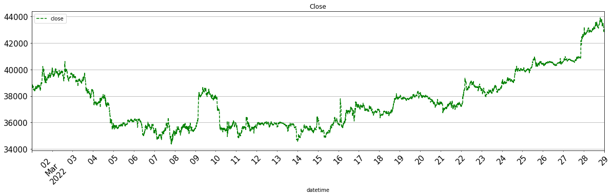
基本的な描画オプション
罫線や描画サイズなど、オプションで変更できます。
df_ohlc_btc_eur["close"].plot(
    grid=True, # 罫線
    figsize=(20,5),  # 描画サイズ。インチ(横、縦)
    title="Close",  # グラフタイトル
    legend=True,  # 凡例
    rot=45,  # xtick の ローテーション
    fontsize=15, # 文字サイズ
    style={"close": "g--"}, # 色と線の種類,
    );
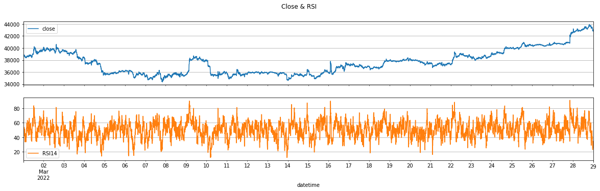
サブプロット
同じ DataFrame にあるデータであれば、 subplots=True オプションでサブプロットできます
import ta

df_ohlc_btc_eur["RSI14"] = ta.momentum.rsi(df_ohlc_btc_eur["close"], window=14)
df_ohlc_btc_eur.tail()
| open | high | low | close | volume | RSI14 | |
|---|---|---|---|---|---|---|
| datetime | ||||||
| 2022-03-28 23:40:00+00:00 | 43026.45 | 43044.51 | 42969.20 | 43038.99 | 2.88405 | 34.685962 |
| 2022-03-28 23:45:00+00:00 | 43052.70 | 43072.27 | 43021.37 | 43034.21 | 1.07998 | 34.485364 |
| 2022-03-28 23:50:00+00:00 | 43027.09 | 43027.09 | 42930.60 | 42948.57 | 1.42620 | 31.023581 |
| 2022-03-28 23:55:00+00:00 | 42948.57 | 42953.04 | 42656.89 | 42794.68 | 19.00424 | 25.977242 |
| 2022-03-29 00:00:00+00:00 | 42787.28 | 42943.00 | 42766.83 | 42893.96 | 5.58367 | 33.493235 |
df_ohlc_btc_eur[["close", "RSI14"]].plot(
    grid=True,
    figsize=(20, 5),
    title="Close & RSI",
    legend=True,
    subplots=True,
    layout=(2, 1),  # レイアウト(行,列)
);
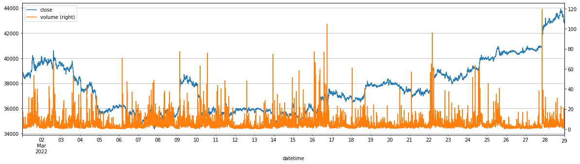
第二軸
secondary_y= オプションで、右側にyの第二軸を取ることができます
df_ohlc_btc_eur[["close", "volume"]].plot(
    grid=True,
    figsize=(20, 5),
    secondary_y="volume",
);
bar について
bar は描画に時間がかかります。
代わりに
areaを使うのが1つの方法かと思います。
# df_ohlc_btc_eur["volume"].head(100).plot(kind="bar", use_index = False, figsize=(20,5) );
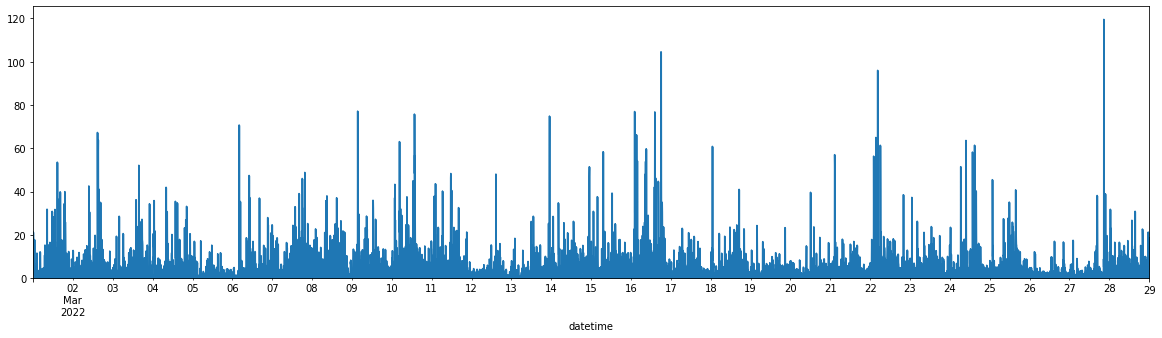
df_ohlc_btc_eur["volume"].plot(kind="area", figsize=(20, 5));
日本語豆腐問題
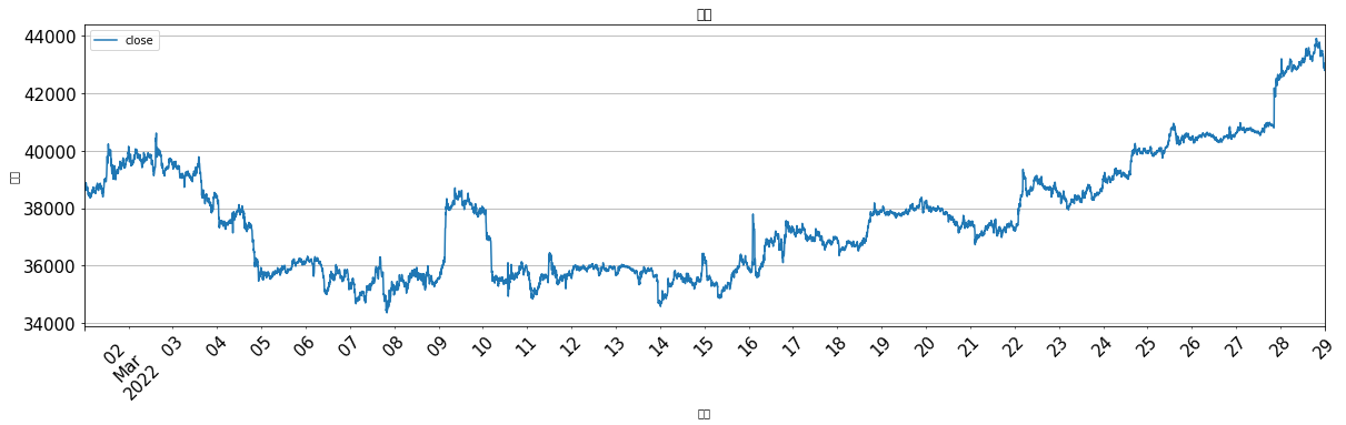
df_ohlc_btc_eur["close"].plot(
    grid=True,
    figsize=(20, 5),
    title="終値",
    legend=True,
    rot=45,
    fontsize=15,
    xlabel="時間",
    ylabel="価格",
);
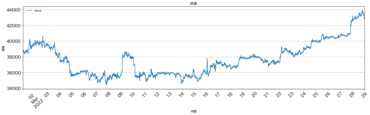
import japanize_matplotlib

df_ohlc_btc_eur["close"].plot(
    grid=True,
    figsize=(20, 5),
    title="終値",
    legend=True,
    rot=45,
    fontsize=15,
    xlabel="時間",
    ylabel="価格",
);
matplotlib と組み合わせて描画する
.plot()だけでは表現できない時はmatplotloibを使います例:価格変化を曜日ごとにサブプロットで描画したい
matplotlib でサブプロットする手順
matplotlib で サブプロット作成
add_subplotsubplots
.plot()のax=オプションに axes オブジェクトを渡す
add_subplot
import matplotlib.pyplot as plt
fig = plt.figure()
fig.add_subplot(総行数,総列数,サブプロット番号)
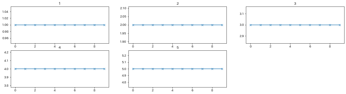
import matplotlib.pyplot as plt

fig = plt.figure(figsize=(20, 5))

for i in range(1, 6):
    ax = fig.add_subplot(2, 3, i)  # 2行, 3列, i番
    pd.Series([i] * 10).plot(ax=ax, title=i, marker="x")
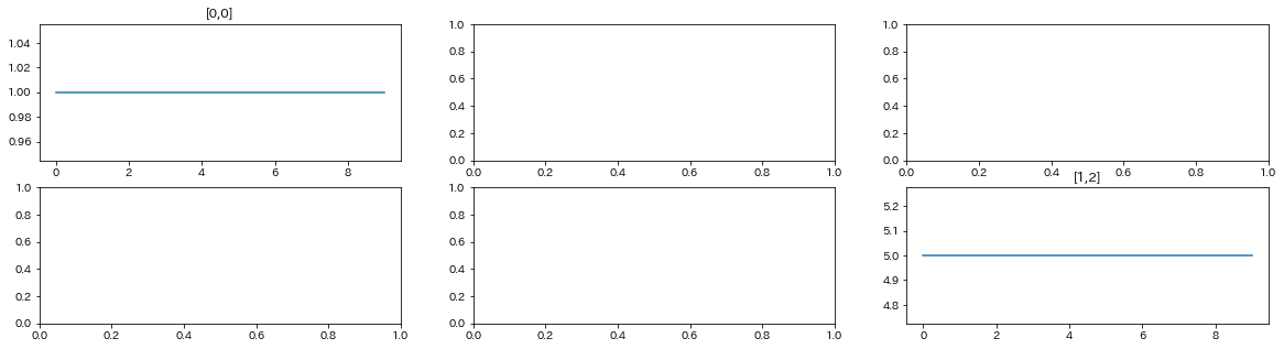
subplots
import matplotlib.pyplot as plt
fig, axes = plt.subplots(総行数, 総列数)
import matplotlib.pyplot as plt
fig, axes = plt.subplots(2, 3, figsize=(20, 5))

pd.Series([1]*10).plot(ax=axes[0,0], title="[0,0]")
pd.Series([5]*10).plot(ax=axes[1,2], title="[1,2]");
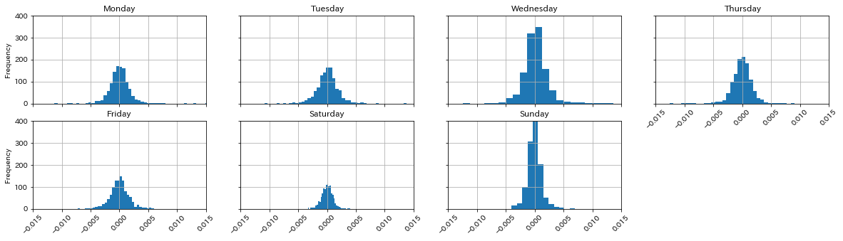
曜日ごとに分けてヒストグラムを描画
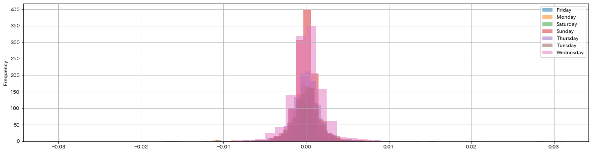
df.plot(subplots=True)は複数データが全く同じIndexを持つ場合は使用出来ますが、groupby などで分割したデータには使用出来ません。その場合は
matolotlibのsubplotsなどを使う必要があります
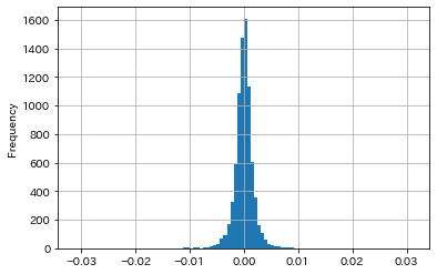
# 曜日を追加 (dayofweek (Monday=0, Sunday=6) でも可)
df_ohlc_btc_eur["day_name"] = df_ohlc_btc_eur.index.day_name()

# 5分毎の価格変化を追加
df_ohlc_btc_eur["price_change"] = df_ohlc_btc_eur["close"].pct_change()
df_ohlc_btc_eur.tail()
| open | high | low | close | volume | RSI14 | day_name | price_change | |
|---|---|---|---|---|---|---|---|---|
| datetime | ||||||||
| 2022-03-28 23:40:00+00:00 | 43026.45 | 43044.51 | 42969.20 | 43038.99 | 2.88405 | 34.685962 | Monday | -0.000097 |
| 2022-03-28 23:45:00+00:00 | 43052.70 | 43072.27 | 43021.37 | 43034.21 | 1.07998 | 34.485364 | Monday | -0.000111 |
| 2022-03-28 23:50:00+00:00 | 43027.09 | 43027.09 | 42930.60 | 42948.57 | 1.42620 | 31.023581 | Monday | -0.001990 |
| 2022-03-28 23:55:00+00:00 | 42948.57 | 42953.04 | 42656.89 | 42794.68 | 19.00424 | 25.977242 | Monday | -0.003583 |
| 2022-03-29 00:00:00+00:00 | 42787.28 | 42943.00 | 42766.83 | 42893.96 | 5.58367 | 33.493235 | Tuesday | 0.002320 |
df_ohlc_btc_eur["price_change"].plot(kind="hist", bins=100, grid=True);
# 参照: Botterのためのpandas入門 https://botter4pandas.readthedocs.io/ja/latest/resample.html

df_ohlc_btc_eur.groupby("day_name")["price_change"].plot(
    kind="hist",
    bins=50,
    grid=True,
    legend=True,
    figsize=(20, 5),
    alpha=0.5,
);
import matplotlib.pyplot as plt

fig = plt.figure(figsize=(20, 5))

i = 1
for name, s in list(df_ohlc_btc_eur.groupby("day_name")["price_change"]):
    ax = fig.add_subplot(2, 4, i)
    s.plot(
        kind="hist",
        ax=ax,
        title=name,
        xlim=(-0.015, 0.015),
        ylim=(0, 400),
        sharex=True,
        sharey=True,
        grid=True,
        bins=50,
        rot=45,
    )
    i += 1
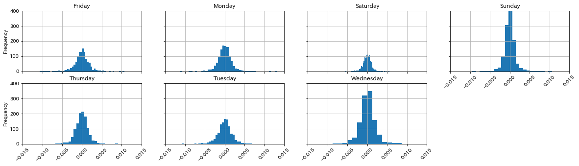
daynames = [
    "Monday",
    "Tuesday",
    "Wednesday",
    "Thursday",
    "Friday",
    "Saturday",
    "Sunday",
]

import matplotlib.pyplot as plt

fig = plt.figure(figsize=(20, 5))

i = 1
grp = df_ohlc_btc_eur.groupby("day_name")["price_change"]
for name in daynames:
    s = grp.get_group(name)
    ax = fig.add_subplot(2, 4, i)
    s.plot(
        kind="hist",
        ax=ax,
        title=name,
        xlim=(-0.015, 0.015),
        ylim=(0, 400),
        sharex=True,
        sharey=True,
        grid=True,
        bins=50,
        rot=45,
    )
    i += 1
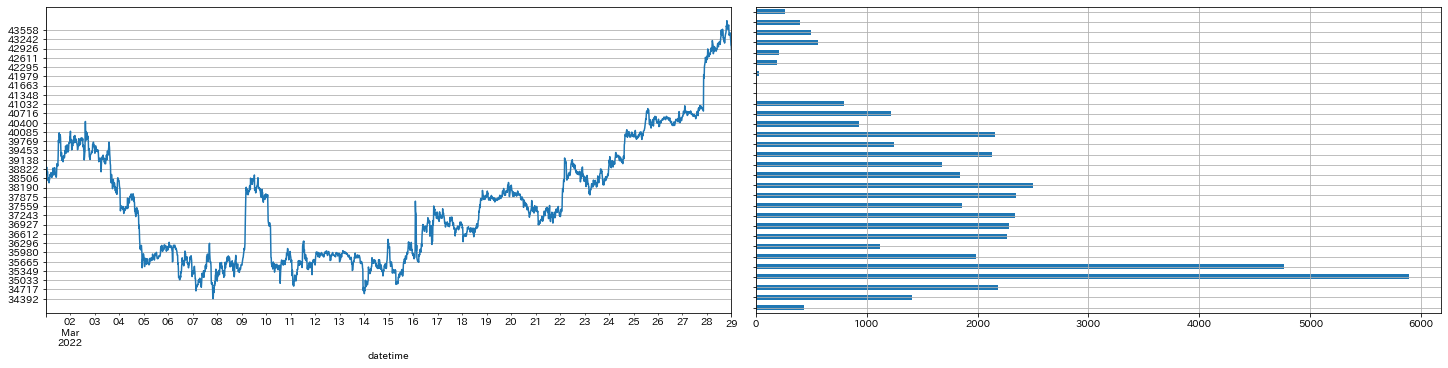
価格帯別出来高
頂いたアンケートで、価格帯別出来高と market depth の描画についてのご質問が多かったので、この2つを .plot と matplotlib で描画する方法を紹介
ただ、ここで紹介する方法よりも、plotly を使ったほうが楽です。
# 15分OHLCVを作成
df_15min = df_btc_eur["price"].resample("15min", label="right").ohlc()
df_15min["volume"] = df_btc_eur["size"].resample("15min", label="right").sum()

# pandas.cut https://pandas.pydata.org/docs/reference/api/pandas.cut.html
df_15min["pricecut"] = pd.cut(
    df_15min["close"],
    30,
).apply(lambda x: x.left)
s_vol_by_price = df_15min.groupby("pricecut")["volume"].sum()
pd.cut(df_15min["close"],30,).head()
datetime
2022-03-01 00:15:00+00:00    (38506.104, 38821.835]
2022-03-01 00:30:00+00:00    (38506.104, 38821.835]
2022-03-01 00:45:00+00:00    (38821.835, 39137.565]
2022-03-01 01:00:00+00:00    (38821.835, 39137.565]
2022-03-01 01:15:00+00:00    (38506.104, 38821.835]
Freq: 15T, Name: close, dtype: category
Categories (30, interval[float64, right]): [(34392.138, 34717.34] < (34717.34, 35033.071] < (35033.071, 35348.801] < (35348.801, 35664.531] ... (42610.599, 42926.329] < (42926.329, 43242.059] < (43242.059, 43557.79] < (43557.79, 43873.52]]
df_15min.head()
| open | high | low | close | volume | pricecut | |
|---|---|---|---|---|---|---|
| datetime | ||||||
| 2022-03-01 00:15:00+00:00 | 38500.00 | 38911.58 | 38500.00 | 38709.50 | 36.81053 | 38506.104 |
| 2022-03-01 00:30:00+00:00 | 38717.66 | 38737.22 | 38532.55 | 38699.72 | 8.61861 | 38506.104 |
| 2022-03-01 00:45:00+00:00 | 38708.79 | 38855.14 | 38660.00 | 38832.02 | 12.49577 | 38821.835 |
| 2022-03-01 01:00:00+00:00 | 38841.55 | 39014.56 | 38687.39 | 38882.82 | 22.28080 | 38821.835 |
| 2022-03-01 01:15:00+00:00 | 38883.49 | 38932.19 | 38616.54 | 38635.33 | 9.86671 | 38506.104 |
s_vol_by_price.head()
pricecut
34392.138     435.63711
34717.34     1412.83708
35033.071    2183.13348
35348.801    5886.14376
35664.531    4763.29875
Name: volume, dtype: float64
import matplotlib.pyplot as plt

fig, axes = plt.subplots(
    1, 2, figsize=(20, 5), constrained_layout=True
)  # constrained_layout: サブプロット同士をいい感じで描画

df_15min["close"].plot(ax=axes[0], yticks=s_vol_by_price.index, grid=True)
s_vol_by_price.plot(kind="barh", ax=axes[1], sharey=True, grid=True);
Market Depth
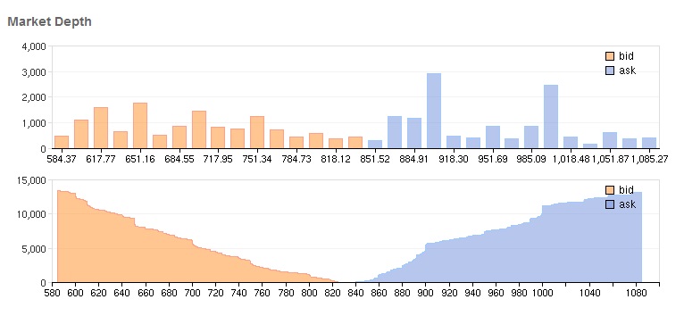
import asyncio
import nest_asyncio
import pandas as pd
import plotly.graph_objects as go
import pybotters
from IPython.display import HTML

nest_asyncio.apply()
async def get_trades(market_name):
    async with pybotters.Client(
        apis={"ftx": ["", ""]}, base_url="https://ftx.com/api"
    ) as client:
        res = await client.get(
            f"/markets/{market_name}/orderbook",
            params={"depth": 50,},
        )
        return await res.json()

# 取得したデータを確認
data = asyncio.run(get_trades("BTC-PERP"))
df_bid = pd.DataFrame(data["result"]["bids"], columns=["price", "size"])
df_ask = pd.DataFrame(data["result"]["asks"], columns=["price", "size"])
df_bid.head()
| price | size | |
|---|---|---|
| 0 | 38446.0 | 13.0032 |
| 1 | 38445.0 | 3.4243 |
| 2 | 38444.0 | 3.4657 |
| 3 | 38443.0 | 21.5015 |
| 4 | 38442.0 | 1.7437 |
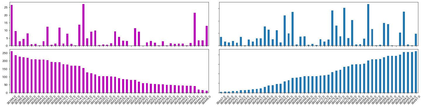
import matplotlib.pyplot as plt

fig, axes = plt.subplots(2, 2, figsize=(20, 5), constrained_layout=True)

df_bid["size"][::-1].plot(kind="bar", ax=axes[0, 0], color="m", sharex=axes[1, 0])
df_bid["size"].cumsum()[::-1].plot(kind="bar", ax=axes[1, 0], color="m", rot=45)
axes[1, 0].set_xticklabels(df_bid["price"][::-1])


df_ask["size"].plot(kind="bar", ax=axes[0, 1], sharex=axes[1, 1], sharey=[0, 0])
df_ask["size"].cumsum().plot(kind="bar", ax=axes[1, 1], rot=45)
axes[1, 1].set_xticklabels(df_ask["price"]);
テーマ変更
matplotlibのstyleを変える - Qiita https://qiita.com/eriksoon/items/b93030ba4dc686ecfbba
Style sheets reference — Matplotlib 3.5.1 documentation
plt.style.use("bmh")